Sherdian EDGE
1 Product Manager,
2 Designers,
1 User testing,
1 User Researcher
Team
3 months,
Jan 2022-Apr 2022,
Time
Primary Resaerch,
Wireframe,
Prototype,
User Testing
Contribution
Figma
User Testing.com
Trello
Tools
Overview
EDGE is a Sheridan owned entrepreneurship program that helps accelerate ventures.
Background
In the past, EDGE's website has been it's online identity, however, it has failed to communicate EDGE's message & its benefits unequivocally. In this new digital experience, we are addressing this gap with effective design, and also hope to embody EDGE's personality and identity as the community centred, start up ecosystem.
It takes a long time for users to find useful information.
Challenge
We did some research to understand why users can't find important information currently and drew these three insights.
Redefine the information hierarchy and enhance the visualization of information
Solution Brief
At the same time, add the real picture of the project, use pink appropriately on the page.
Define Problem
Why can't the Edge website clearly convey the information ?
Survey Question
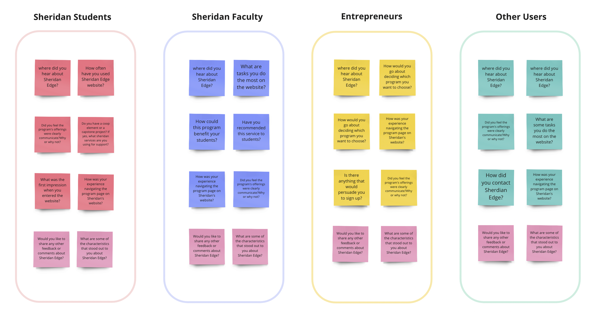
According to different procedures of Sheridan Edge service, we surveyed four user groups, namely Sheridan students, Sheridan faculty, No sheridan association (entrepreneurs) and other users, and we designed different survey questions for each group.
We used affinity graphs to help our team organize similarities in questions cited by respondents and find key pieces of information.
Core insights
Ideation
Research
Based on our survey results, Sheridan students are our biggest target market. We recognized that overall look and professionalism was lacking on the EDGE website. At the same time,we also learned about the clutter of website content and how it affects potential users when users browse the site.
3Persona
We have an insight into the need for more attention to information presentation. The rationality of information hierarchy will directly affect the priority and importance of information transmission, as well as the quality and efficiency of user reception.
Solution
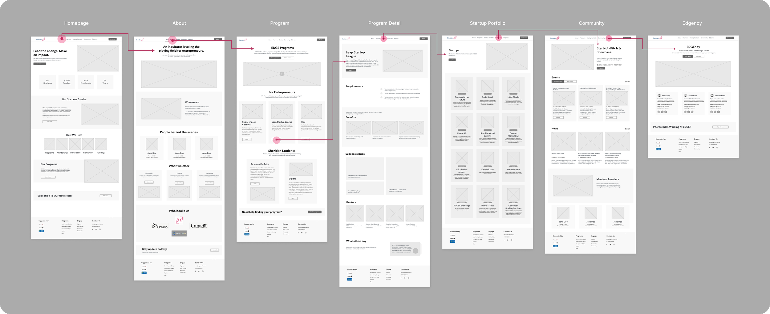
Mid-Fidelity Wireframes
Deriving from our sketches we did mid-fidelity wireframes to get more accurate depictions of the layout of the project as well as give a glimpse of how the final project or product will be.
1st User Testing&Iteration
Change in wireframe
Our team uses the User Testing website to find different participants according to the characteristics of the website to test the wireframe of our website.
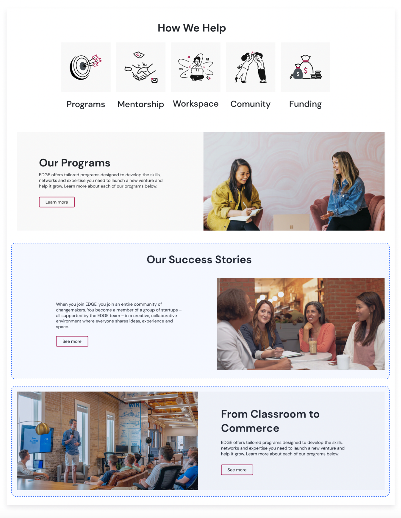
Shifted the “our success stories” section below the “how we help” and “our program” section.
Additions & Changes
1
A faculty section added, called "From the classroom to commerce" encouraging Sheridan faculty involvement.
Rationale
People can understand what services EDGE offers before they read how people succeeded with it.
Faculty support is essential for EDGE and needs to be encouraged.
When clicking a card, opens a popup card with the full description and the organization's website.
Additions & Changes
2
Before, the cards linked directly to the organization's website. With this change, users can read the full description then decide to visit their website
Rationale
Core insights
Upon presenting our information during the industry check-in, there were several key takeaways that they recommended.
Participants
Industry Partner Feedback
Changes in wireframes are based on feedback from the first round of testing, insights from Industry Partners and advice from Professors.
2nd User Testing&Iteration
Core insights
Notes & observations we’ve captured from our tests, including transcripts.
Final iterations after running additional tests, based on our core insights and feedback from Professor.
Change in design
Made the Chatbox icon smaller and the position on the bottom right at all times.
01 Chatbox
For the about 'EDGE Team' and 'Founders' in Community" section, we added a social link button to the cards.
02 Social link
The adjusted shade of the primary button to be warmer and muted instead of pure black to increase appeal.
03 Primary Button
Explicitly stated the the Sheridan relationship on the home page.
04 Sheridan Relationsip
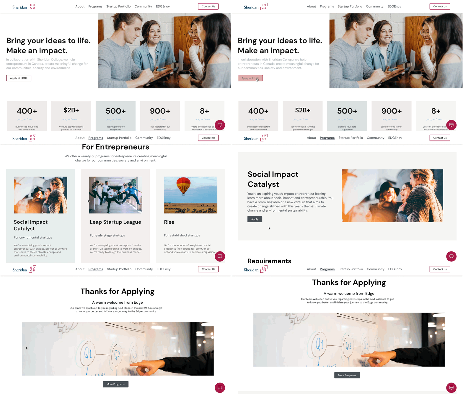
Final prototype
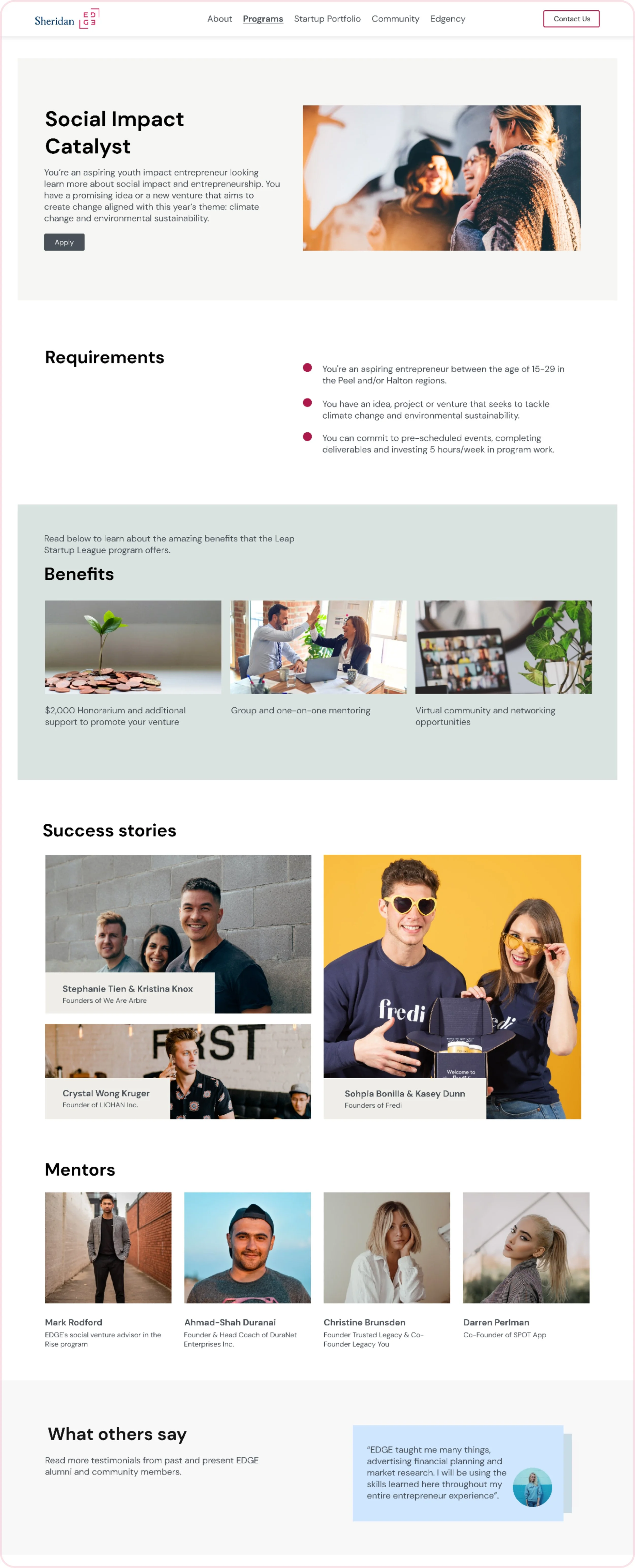
The Edge program page can classify Sheridan students and entrepreneurs, which can help users choose more conveniently
Key insight
Add the real picture of the project, use pink appropriately on the page, and reorganize the page information to distinguish the information level.
Visual Design
Reflection
What did I learn and what were the challenges?
I have learned the importance of clear information hierarchy, visualizing content, and using authentic images from Sheridan's Edge project. We faced challenges with confusing information structure, too much text, and a lack of real pictures. To improve, we redefined the information layout, added visuals, and effectively communicated the project's advantages, enhancing user experience and engagement. User feedback played a crucial role in making adjustments and improvements to better support student entrepreneurs.


